


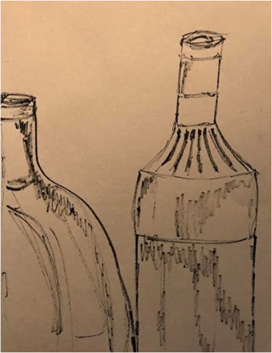
Using chalk to highlight certain areas gives the illusion of a 3D image. The marks and lines made by the charcoal shows the shape and curves of the bottles.


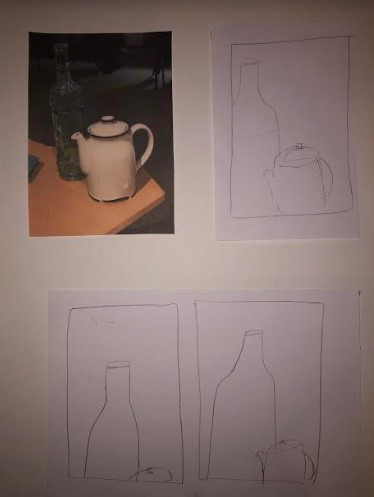
Making quick drawings like these has helped to show how you can add darker tones easily in your drawings.


Ink drawings are a way of creating realistic pieces of art. It makes it easy to get the correct size of each object and to get perfect shading to make it look life-like.

This ink drawing looks exactly like my original drawing, with the shading being drawn in the same way.

This ink drawing was done by a piece of collage work. The harsh tones in the bottles accompanied with the linear lines in the background adds a cubism effect to the art.


Layering more prints onto the same colour subtly shows the shapes overlapping each other. This piece would visually be stronger if there were multiple colours on the plate as each shape would be more prominent.

Having black and orange ink has made each layer of the print to be more noticeable.

Mono-print plate layout.

Printing onto black paper isn't as impressive as printing on white paper because the colours don't print as bright. Although printing with white ink and then layering with another colour could be fascinating.


The more you overlay the prints, the stronger the outcome will be. Having the orange and black ink mixed together slightly has added another shade into the print, making it visibly engaging.

Using blue ink instead of black has made the prints more lively and as orange and blue are complimentary colours, the prints have improved.

Printing on white tissue paper makes the print look like it has more texture than the other prints. To develop this print further, using different coloured tissue paper could improve this piece.


A collage background combined with charcoal and chalk makes the art visibly intriguing. The background gets rid of the negative space while the charcoal and chalk adds tones and highlights.


This piece could be improved by using more than one material. Using chalk to highlight would make the object stand out more.

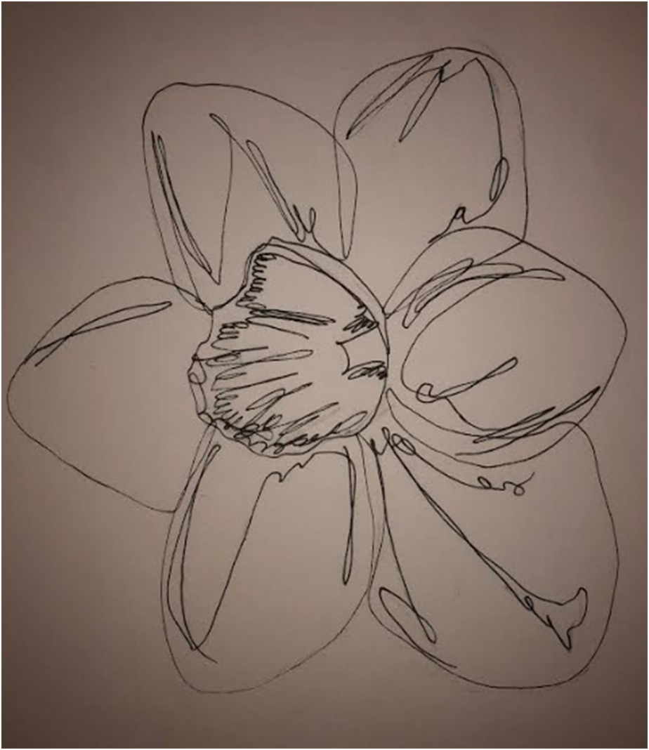
Continuous line drawings are an interesting way of drawing as it helps the lines to flow better. As you can't lift the pen off the paper, the lines become more organic as they create softer contours and shapes.


Water colour and fine liner seem to go good together as the fine liner shows the shape of the object and the watercolour makes it look less dull.

Using a continuous line adds interesting lines in the piece. Its has tones in some places without shading in the complete area. The continuous line drawing could be developed by adding watercolour to create depth and tone. Or putting a light coloured wash over the entire page would make it stand out more.

This painting was created by using watercolour, coffee and spices. To develop this piece further, using coffee or spices that are less watered down could bring more definition to areas of the work.

Adding more dots to the shaded areas would make the image more tonal and exciting.


These continuous line drawing could be more exciting if the negative space had a slight colour. To develop these further, using different materials could make the marks more lively.


By making quick drawing with charcoal, you get some exciting lines and marks. Although, using the charcoal to make some areas even darker could make the piece more successful.


Drawing without looking at the paper makes interesting lines and shapes.


This piece was created on Photoshop by overlaying two mono prints and changing the hue/saturation and opacity. By overlapping two print, it gives the illusion that the print has more layers than it does. This could be developed by masking out some of the shapes and creating a completely different print.


Drawing on black and white paper at the same time makes the piece look more interesting as it has a contrast between the shades. Doing this with a continuous line as well shows off some intriguing shapes.

Marker pens and fine liners seem to work well together, with the marker giving darker tones and the fine liner shading in the medium tones. Adding black ink to the background could finish the piece off nicely.

Using charcoal on this drawing has shown to be successful, with the charcoal making dark and medium tones throughout the object. Adding an ink wash to the background would get rid of the negative space, which would improve the piece even further.


